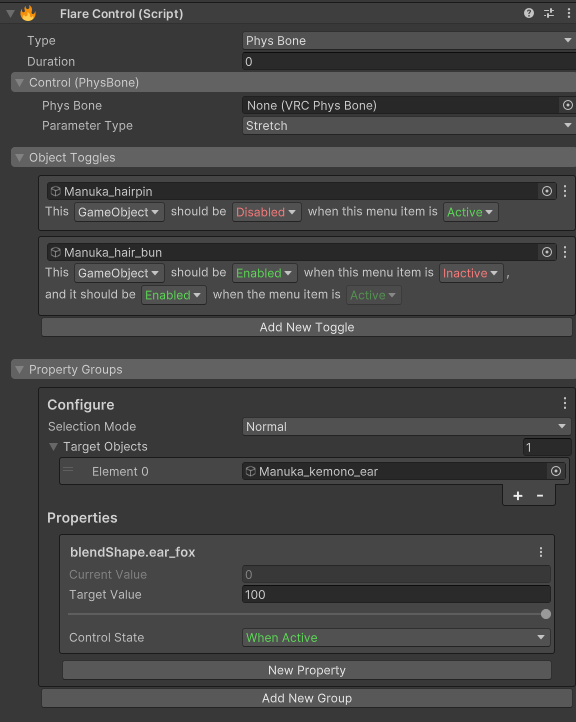
Flare Control
The Flare Control is the heart of this tool. There are multiple parts to it, but once they're understood the component becomes trivial to work with.

Stateful
This is important. When working with Flare Controls, you will see two words highlighted in green and red respectively, "Active" and "Inactive". For every toggle or property you set up, there will be one Active/Inactive value you can change. The opposite of that state how your avatar is currently in the editor.
As an example, you can have a toggle that disables an object when it is Inactive. Let's say this object is the
avatar's shirt. In the editor, it's enabled. Flare will interpret the object being disabled when it's Inactive and
the object being enabled when it's Active. You can override this to be a value you pick if you don't want to rely
on the editor state for your controls.
Anatomy
Each FlareControl has a parameter that drives it, and that parameter can be represented as a value from 0 to 1.
When "the control" is at 0, it is inactive. When the control is at 1, it is active. For Radials,
PhysBones, and Contacts, that value can be somewhere in between.
Every control has section for the selected control type, object toggles, and property groups. You can learn more about each one of those below.
Type
The type of the control. This determines how the control is represented on the avatar.
- Menu - Creates a (synced) menu item.
- PhysBone - Drive a control using a PhysBone parameter. This includes Stretch, Squish, IsPosed, IsGrabbed, and Angle.
- Contact - Drive a control using a contact receiver.
Duration
Interpolate your control. This value is in seconds. The control will take (duration) long to go from 0 to 1 (False to True) and vice versa. You can use this to create smooth transitions, simple dissolve effects, and gradual activations.
Controls
Menu Item
This will be the control you use most often (most likely). It creates a menu control on your avatar which you can control in game.
Menu Type- The type of the menu item.Toggle- A simple toggle. Turns on and off.Radial- A radial that goes from 0 to 1.Button- A button which is only turned on when pressed.
Name- The name of the menu (and parameters).Icon- The icon used in the menu.Is Saved- Is the state of this control persisted through world changes, avatar changes, and avatar resets?Default Value(Toggle and Radial) - The default value of the control.

PhysBone
Allows you to drive the control's value with a PhysBone parameter.
Phys Bone- The PhysBone to get parameters from.- If this PhysBone already has a parameter assigned to it, Flare will use that instead of generating its own.
Parameter Type- The parameter to drive the control with.StretchSquishedIs GrabbedIs PosedAngle
Contact
Allows you to drive the control's value with a Contact Receiver.
Contact Receiver- The Contact Receiver to use.- If this Contact Receiver already has a parameter assigned to it, Flare will use that instead of generating its own.
Object Toggles
Toggles let you set the activity of a GameObject, Behaviour, or a Renderer. It is called the Target.
When dragging in an object as the Target when there was nothing there before while the Type of the control
is of Menu and the Menu Type is a toggle, Flare will try to predict the settings you want.
It uses the Default Toggle Value and compare it with the current activity state of the Target within the editor.
If your Default Toggle Value is ON (when your menu is Active) and you drag in a GameObject that is enabled,
it will configure the toggle to be disabled when the menu is Inactive. You can manually configure the toggle state
to follow the exact condition.
Each toggle follows a simple sentence structure: This [Target] should be [Enabled / Disabled] when the menu item is [Active / Inactive]. If you're unsure on what a toggle does, just read it out loud
until it makes sense.
Each toggle uses the Editor state for the "opposite/default" value. If you want to override this behaviour,
you can enable Override Default Value in the context menu of the toggle.
Find more examples on the examples page.
Property Groups
Property groups allow you to control any animatable properties on the avatar (Materials, Blendshapes, PhysBones, most component properties). Properties are put into groups which determine how its animated.
Groups
Selection Mode- Normal - Directly select individual properties from the included GameObjects.
- Avatar - Searches the entire avatar for properties to animate and will apply those properties to every matching property.
Target Objects- When in
Normalmode, the objects provided in here are used entirely for searching and selecting the properties provided.
- When in
Objects To Exclude- When in
Avatarmode, the property animator will skip over the objects provided.
- When in
Property
Properties in Flare support booleans, integers, floats, vectors, and colors.
Current Value(Readonly) - The current value of the property Editor. This is also the value of the opposite of the control state.Target Value- The value you want the property to when theControl Stateis set to.Control State- Determines which value the property will be depending on the state of the control.- If it is
When Active, when the control isActive(or 1), the selected property will be set toTarget Value, and when the control isInactive(or 0), the selected property will be set to theCurrent Value.
- If it is
If you don't want to use the Current Value (the Editor value) as the opposite/default value,
you can enable Override Default Value in the context menu for each property.

That's it (for now)! Check out the examples over on the examples page. to see some of the things you can make.